
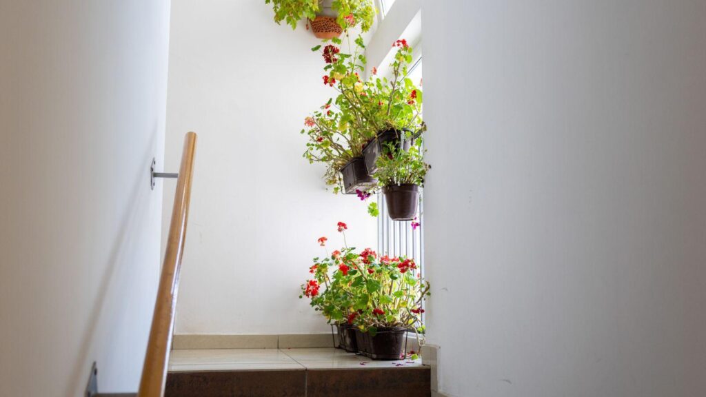
Flowers bring colour and life into a room, but the best arrangements do more than just fill a gap on the sideboard, they respond to the space around them. Whether you're arranging for a special occasion or working through the stems from a flower subscription, it helps to think about the colours already in your home before you start.
You don't need every flower to match the furnishings. A bit of contrast often works better. What matters is getting a feel for the room's dominant tones and deciding whether you want the flowers to blend in, add a gentle lift, or become the focal point.
Start with the Room's Dominant Colours
Have a look around and notice what actually defines the room, the walls, the flooring, a big sofa, or heavier textiles like curtains and rugs. Most rooms have one main colour, a couple of supporting tones, and a few smaller accents. Once you've spotted this pattern, choosing flowers gets easier, pulling out just one or two colours is usually enough to make the arrangement feel like it belongs.
Working with Neutral Rooms
Neutral spaces, done out in white, cream, beige, taupe or grey, are forgiving and give you plenty to play with. For something calm, stick to similar tones, white roses, cream chrysanthemums and pale hydrangeas sit beautifully without overwhelming the room.
Or use flowers to bring in a real hit of colour instead. Deep burgundy, rich orange or hot pink can look fantastic against pale walls; pick one strong colour and let greenery support it so it still feels elegant.
Undertone matters too. Warm neutrals suit peach, rust and golden yellow, while cooler greys and crisp whites lean towards lavender, blue and pale pink.
Trying a Tonal Colour Scheme
A tonal scheme uses different shades of the same colour, and it suits a room that already has a strong colour identity. In a blue room, pair pale delphiniums with something deeper in blue or violet. In a pink room, blush roses and dusky carnations can add depth without pulling in unrelated colours.
Mixing textures and shapes stops a tonal arrangement looking flat, combine big rounded blooms with finer stems and loose foliage. This suits bedrooms and formal sitting rooms, anywhere you want a calm, coordinated feel.
Bringing in Complementary Colours
Complementary colours sit opposite each other on the colour wheel and make each other pop, think blue and orange, yellow and purple, red and green. These pairings work when you want the flowers to genuinely stand out. Blue upholstery might come alive with apricot roses; a green room lets red or burgundy flowers catch the eye.
Because these pairings are bold, it helps to hold back elsewhere and let the flowers respond to just one strong colour in the room.
Picking Up on Accent Colours
Lots of rooms have small accent colours in cushions, lamps or ceramics. Echoing one in your flowers is a simple way to tie the arrangement to the room; terracotta accessories might be picked up with peach or burnt orange blooms, while emerald green touches could be matched with white flowers and plenty of foliage. This works because the flowers don't need to match the big furniture, just the details already there.
Thinking About Colour Temperature
Red, orange, yellow and most pinks are warm; blue, green, violet and some whites are cool. A warm arrangement, sunflowers, orange tulips, red dahlias, suits spaces with warm wood or earthy fabrics and feels cosier. Cooler flowers like delphiniums, lavender or white lilies suit marble, chrome or cool-toned walls and create a calmer mood.
You can also use flowers to balance a room's temperature: warm peach or yellow blooms lift a cool grey space, while white or pale green flowers freshen up a room full of rich timber and terracotta.
Don't Forget the Greenery
Foliage does a lot of quiet work. Green behaves almost like a neutral, softening the join between flowers and room. Eucalyptus, ferns and olive branches add structure without piling on more colour, and if the room already has plants or botanical prints, generous foliage reinforces that. Silver-green suits cooler, contemporary interiors, while forest or olive tones suit traditional or warmer rooms.
Choosing the Right Vase
The vase is part of the arrangement, not just a container. A clear glass vase keeps the focus on the flowers and works almost anywhere. A coloured vase can echo a tone in the room or provide contrast, a dark vase grounds pale flowers, while a white one softens a bolder bunch. Patterned vases need more thought in rooms that already have plenty of pattern; a plain vase often gives a calmer base.
Letting the Seasons In
Spring often brings soft yellow, blush pink and fresh green; summer allows brighter shades; autumn suits rust and burgundy; winter tends towards white, red and dark green. These shifts don't have to clash with your room's existing palette, just choose seasonal colours that sit comfortably alongside it.
Aim for Balance, Not a Perfect Match
Flowers were never really about an exact match. Ones that mirror the room too closely can disappear into it, while too many unrelated colours feel messy. Balance is the real goal, pick up one or two existing tones, let a bit of contrast in where it feels right, and use greenery to hold it together.