In most homes, the sofa is the first thing your eye lands on when you walk into the living room — which makes it the natural starting point for every other design decision in the space.
Understanding Your Living Room’s Visual Anchor
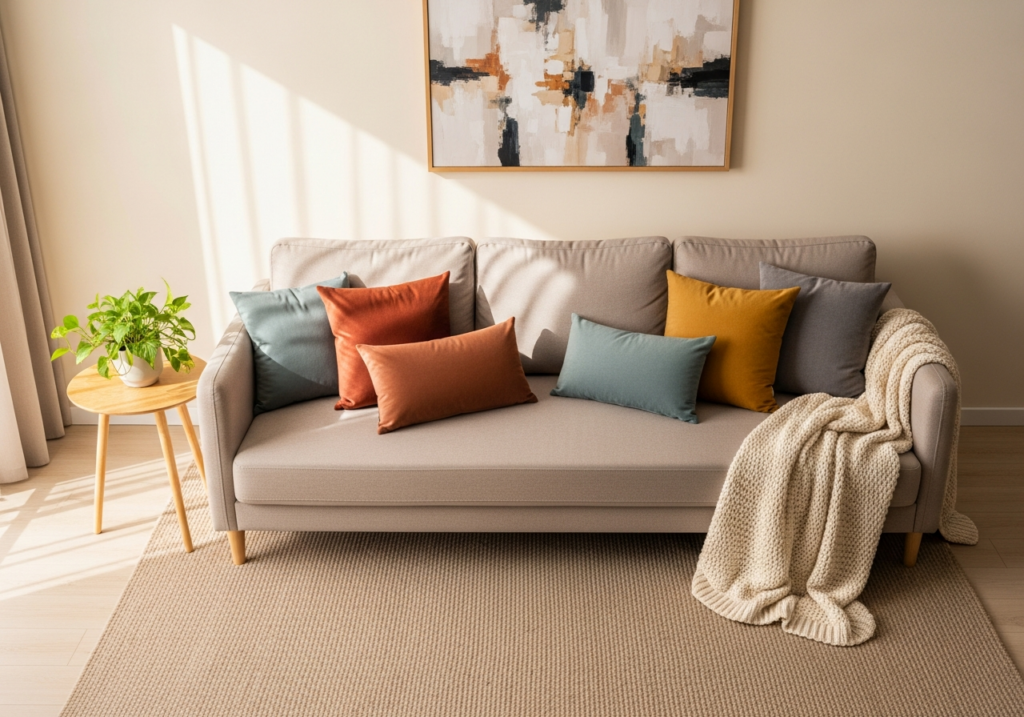
Whether you’re working around a light gray sectional, a navy loveseat, or dark brown couches, the core challenge remains the same: building a palette that feels balanced, welcoming, and distinctly yours. It’s a surprisingly common frustration — a room that looks mismatched or overly busy, with no clear sense of which wall colors, rugs, or accents will actually complement what you already own. This guide walks through a practical, evergreen process for solving exactly that.Your sofa is almost always the starting point for a cohesive color scheme. Interior designers commonly refer to it as the visual anchor — the piece that draws the eye first by virtue of its size, color, or placement. Larger, darker sofas tend to dominate a room more than lighter ones simply because greater visual mass and higher contrast naturally command attention.
Most anchor sofas fall into one of three tonal families:
– Warm tones: browns, cognacs, rusts, camel
– Cool tones: charcoal, navy, slate
– Neutrals: beige, ivory, soft gray
Identifying which family your sofa belongs to is the essential first step — it determines which surrounding colors will feel harmonious and which will quietly undermine the whole room.
Why Undertones Matter More Than the Color Name
A “brown” sofa isn’t simply brown. It carries undertones that shape how it reads in a room, and those undertones matter more than the color name on the label. A chocolate brown leans warm, carrying red and orange undertones, while an espresso shade leans cooler — closer to near-black with subtle hints of violet or gray. These distinctions become critical when selecting wall colors and textiles.
- Warm-toned sofas pair naturally with creamy whites, warm beiges, muted greens, and terracotta accents.
- Cool-toned sofas tend to work better alongside soft grays, dusty blues, and charcoal details.
Texture adds another layer of nuance. Leather reflects light and can make even a large sofa feel slightly less heavy, while fabric absorbs light and reads as more matte. Layering contrasting textures — a linen throw, a knitted cushion, a velvet pillow — keeps a visually dominant sofa from feeling flat or overwhelming.
Key takeaway: Match undertones first, then vary texture to add interest and depth.
Building the Palette: Walls, Textiles, and Accents
Walls and flooring set the overall mood of the room, so they deserve careful thought. For a dark anchor sofa in a smaller space, soft whites, light greiges, or pale warm neutrals create enough contrast to make the room feel more open and airy. In a larger room — or one where a cozy, enveloping atmosphere is the goal — deeper wall tones like muted sage, dusty blue, or warm taupe can wrap beautifully around a neutral or dark sofa.
Rugs and curtains function as the visual bridge between the sofa and the walls. A neutral or subtly patterned rug grounds a dominant sofa without competing with it, while curtains chosen one or two shades lighter or darker than the walls tend to feel cohesive rather than disconnected. Neither element needs to be bold to do its job well.
For accents — throw pillows, artwork, smaller decorative objects — warm tones like mustard, rust, and olive create an inviting atmosphere around darker sofas, while cool accents such as soft teal or dusty blue introduce contrast and a touch of freshness. Repeat any accent color at least three times across the room to make it feel intentional rather than accidental.
Practical tip: Photograph your room in black and white to quickly assess whether the light and dark areas feel balanced — stripping out color reveals contrast clearly and removes a lot of the visual noise.
Creating a Living Room That Feels Both Intentional and Personal
Once you have a framework, the process becomes surprisingly straightforward: identify your sofa’s undertones and visual weight, choose walls and large textiles that support rather than fight it, then layer in accents and textures that reflect your own sensibility. Most design professionals recommend limiting the core palette to three main colors plus a handful of supporting accent tones — enough variety to feel lively, not so much that it tips into visual clutter.
There is no single correct palette, and there doesn’t need to be. Start with low-risk changes — a new rug, different cushions, a piece of artwork — observe how they feel at different times of day, and adjust gradually. Timeless rooms aren’t built in one sweeping decision; they evolve through small, considered choices made over time.
“When you build your living room palette around your main sofa, every other choice becomes easier and more intentional.”